Work from home – you’d think COVID-19 might have helped me to increase production of my animation and yes, it was true until three days ago. I finished 11 minutes of my 20 minute pilot, so for a brief moment of bliss I went beyond the 50% threshold. But then it happened – no not what you think we’re all healthy in the family, but my son saw one of my earlier concept sketches for the series which I made in my usual drawing style using outlines. And he went “I love this style, I think you should draw all your artwork this way!”.
Honestly I somewhat aspired to have my backgrounds and props drawn in a retro cartoon animation style, you know this false perspective with exaggerated angles, no outlines, like you could see in some older Bugs Bunny cartoons. But honestly it was a struggle. It’s not my style. I couldn’t make it my own. It took me forever to produce background art because of that and it never felt really right.
So I thought “screw it, let me just make a sample animation, take one of the shortest scenes, replace the background art entirely and see if it’s worthwhile pursuing that style”. I did and it was so much better.
New Old Style

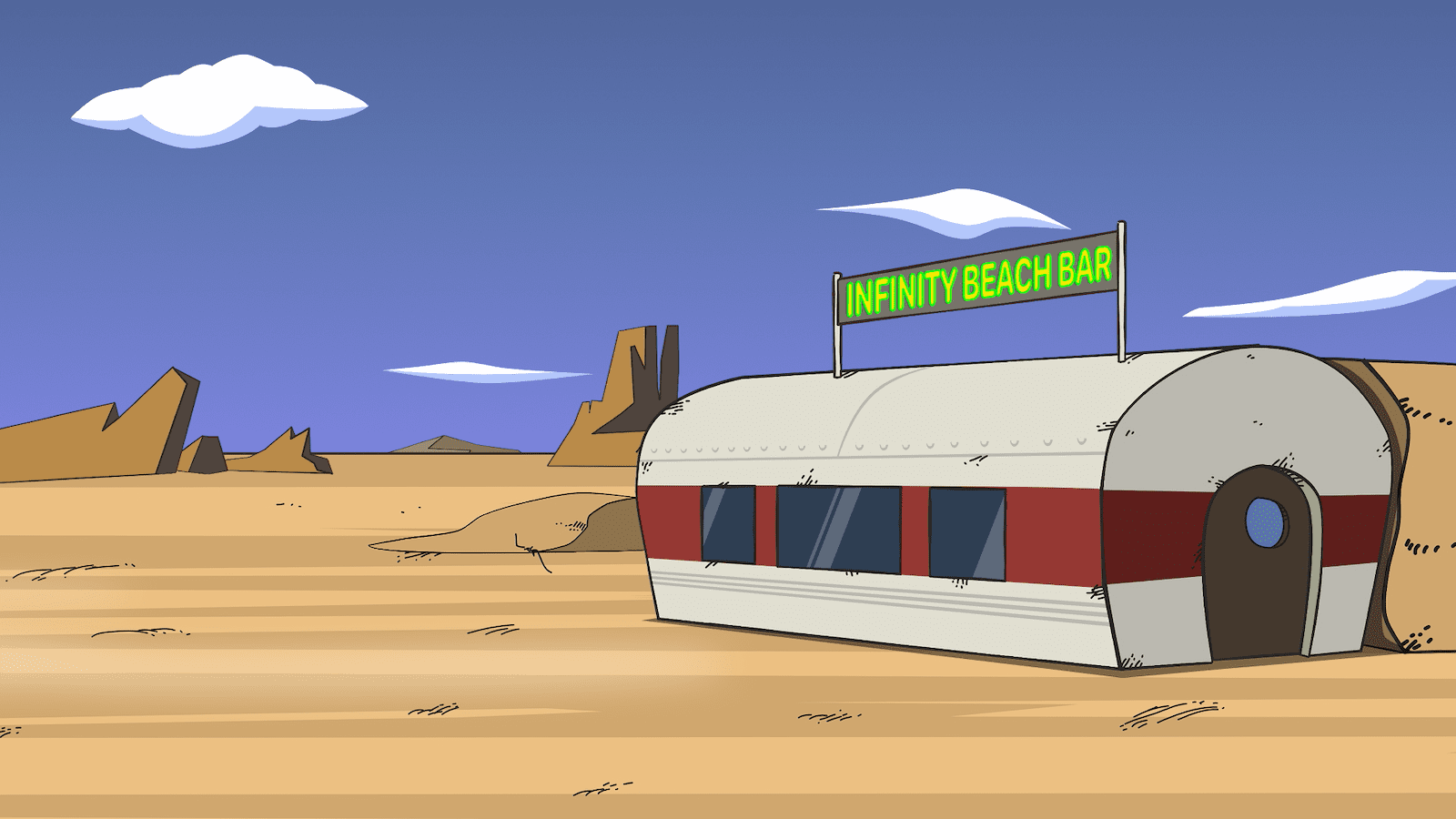
It wasn’t that much work either. All I did was export the backgrounds that I created directly in Moho as SVGs. Then I cleaned them up in Affinity Designer and applied 3pt strokes to most shapes, I also made a few random pressure curves that would create varying line widths, to make the art feel more organically hand-drawn. (You can create these curves in seconds in Affinity and apply them to lines). I also had to add all these tiny strokes and smudges and scratches to the surfaces as a “dirtying down” effect. I really prefer the outline style.
For some reason Moho always screws up the colours on export and import of files, but in this case I liked the accidental colour shift and left it as is (Moho is really bad with colours, my ProRes 422 exports all look really washed out – I’ll have to do colour grading on computer generated animation footage – that’s odd). So, because this was rather painless I decided to do a shot with characters in them. See how that works.

Something was off. It felt better and worse at the same time. Of course it were the thick strongly varied line widths of the characters which would now totally clash with the almost uniform thin lines of the background. Now there’s a tough decision. Go back to the old non outlined backgrounds and leave everything as is, or go through the pain of changing all line widths of all characters and their shapes (hands, mouths, etc.) to a mostly uniform width of 3pt. But you know once you’ve seen something better you cannot unsee it and so I went ahead and started fixing all the characters.
Character Building Exercises
Moho actually lets you import rigged characters from other files into a scene by reference only, which I did, and you ‘d think I’d just update the main source file for each character and that would be it, right? Right? Wrong. Being a one-man operation I never thought much about consequences of any arbitrary decision I made along the way, because if I screw up it would only affect me anyway. So I was stupid enough to keep on improving the character rigs and import newer versions of the characters into some newer scenes, and had older versions in the older scenes. These versions ended up being vastly differently rigged over time, so the 34 scene files I currently have contain various versions of my main characters, which makes this whole operation an epic pain in the neck.
So I think I will rather re-create many of the older scenes using the same latest character rig instead. And honestly this has already improved some of the first scenes, because when I created those I wasn’t all that familiar with the software and I got better at timing animation decently during the last few months. You could call this the silver lining of this tedious process. I’m pretty sure this will delay the whole pilot for about another month. And now I’m not even sure whether I can send it to the film festival I was aiming for, because of that, but I think even if that is the case it will be for the better of the end product.


Line Width Woes
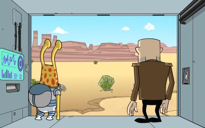
The fake depth of field in the image above is actually a cop-out. The problem with outlines in backgrounds is the following: you want all line widths to be the same at all times. Same for characters, same for backgrounds. As long as you create all of the artwork within Moho, you can tell the app not to compensate for size or zoom level and it will render all line widths the same even if you zoom in or you place things in 3D space much further away. But if you do that, you can’t easily reuse backgrounds across applications or reference the same background from several files, or even replace the same background in several animation files in one go. I need to be able to reuse the same artwork across not only Moho files, but applications, because there are some animations that I have created in Apple Motion. Animations without characters, or pseudo 3D stuff is done much easier and quicker in Motion, also its render speed is just insane, so I use it, whenever I can.
In order to reuse the same background files across apps, I decided to create all my background art in Affinity Designer, export them as PNGs in retina (2x) resolution and reference them as external files from whatever app uses them. There’s only one downside: if you use bitmap backgrounds and you zoom into a scene, naturally the line widths grow visually thicker. At the same time the characters created in Moho, will keep the same line width regardless of size. This is when things start to look weird again. I don’t think there’s an easy solution. The only way (I know) to avoid this is:
- No long zoom-ins
- When switching to close-ups replace backgrounds with bitmaps using thinner line widths (but then I have to start compensating line widths for focal length, and who wants to do that?!)

0 Comments