I have an inexhaustible fascination for dead trees. In my parents’ house we had shelves full of books, some of which were hundred or more years old.
Old books are always an amazing experience, it starts with the blackletter type that has this air of forgotten times. Then there’s the unique feel of the book cover material, be it cloth, cardboard, leather or in rare cases wood covered in leather, and not to forget how cool for a kid embossed letters are. Then the different kinds of paper, each with its unique feel and sound when turning the pages.
Some of the colour prints in our 19th century encyclopaedia had a kind of semi transparent “baking paper” inserted to keep the colour prints from sticking to the other pages – I can still hear the rustling sound those inserts made. And last but not least there’s the book smell: a combination of the scents of old paper, leather or cloth, and residual ink. An experience that goes way beyond the visual content of the pages.
UX Before It Was Cool
Most of this experience isn’t created by happenstance. Decisions a typographer makes, feed into creating the book experience beyond just the content, and that is a conscious creation. That’s why I consider typographers to be the first UX designers, because they covered many of its main disciplines long before the Web: usability, legibility, micro– and macro-typography, visual communication, human cognition, and last but not least user interaction (in terms of qualitative experience using the product).
The Usability Of A Book
Most people believe typography is only about type design and choosing fonts, but even in the print days of the art, the usability of a print product goes way beyond how easy it is to read visually. You concern yourself with paper quality which has an impact on how easy it is to thumb through the pages, adding a register (printed index that shows on the edge of the pages) can make it easier to quickly find pages in a catalogue or book, as will adding a fixed bookmark ribbon.
Put The X In Print
Furthermore the experience of the medium goes beyond just product usability, there’s a clear qualitative angle, e.g.
- Paper type: Glossy paper can convey a high class image with thinner pages, while with stiffer paper, giving it the air of exclusivity could probably better be achieved with a semi gloss finish. For business cards the thickness, texture, and structure of the paper is an immediate, tangible expression of your brand
- Bookbinding: We all know paperbacks are and look cheap
- Embossing, gold ink, 6-colour printing: All there to give a more high-class image, (or to actually improve the quality of the print).
Typography is in its roots about user experience: the usability, as well as the visual, tactile, and sometimes even olfactory stimuli for print products – don’t you love that “new book smell”?
The Evolution of Typography
Typographers were some of the first people to use computers for design probably before most graphic designers. Phototypesetting – long before the mouse, the Macintosh, and the DTP revolution – was mostly done on text based systems, where you write code and tags to create a page layout. Sound familiar?
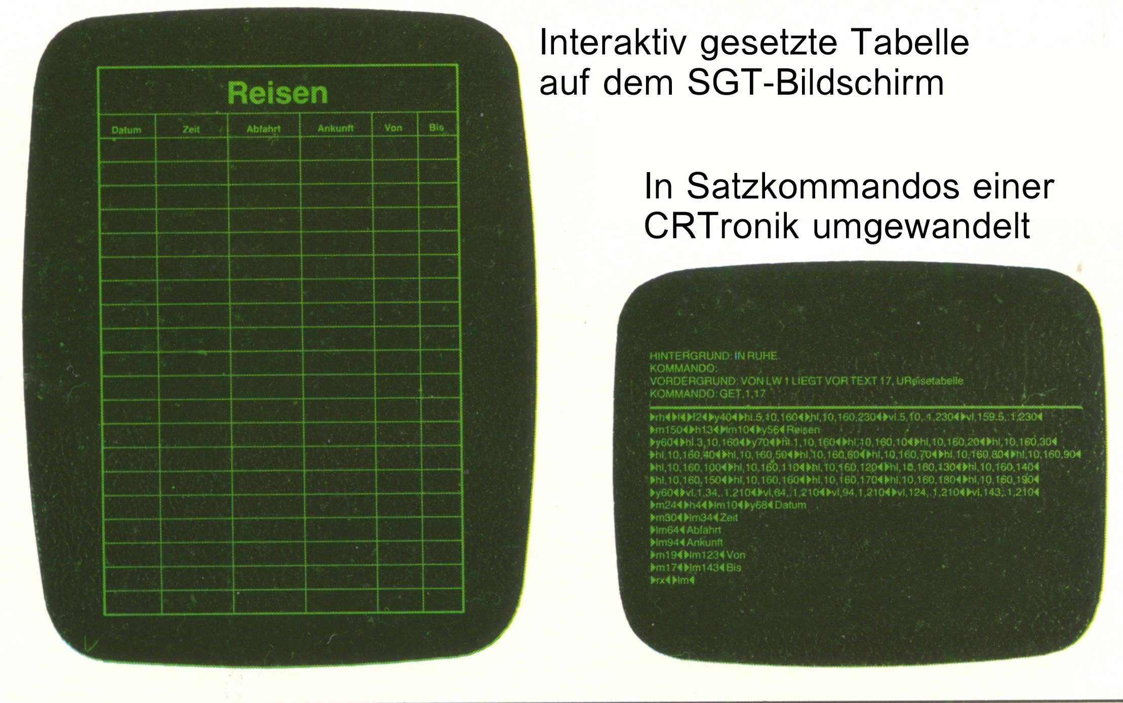
Yes, it turns out HTML, XML, CSS are not much different from the old days when we were writing CRTronic code on the SGT phototypesetting system or similar other systems.
For typographers the barrier to entry into web-design & coding was accordingly low and that’s where many typographers went, to explore this strange, new medium (little did they know that the web would be akin to a second Gutenberg-event).
The Picture Just Gets Bigger
Nowadays I have a hard time putting a label onto what I do, you could call it Problem Solving through Design Thinking, Process Optimisation, and Applied Technology™, but ProSt DeThPOAT doesn’t sound marketable, so we might as well go with Experience Designer and consciously avoiding the acronym, because it feels more confined to the digital experience only. Whatever label we put on it, it doesn’t feel like I ever stopped being a Typographer, the job description just expanded in scale and viewing angle, and evolved into something bigger.
In the quarter century I’ve been doing this, I went from print to web, multimedia (adding interaction and the element of time), video & animation (less interaction, more time), e-commerce (where you can measure usability in money!) to Innovation & Experience Design that goes far beyond merely digital touch points.
All the while the scale and complexity of the problems to solve became larger over the years. The “Picture” became bigger, touching not just visual communication, but to improve usability of a CMS backend, you start looking into and proposing improved internal processes. To achieve the final goal of good design, you look at all the touchpoints within a company to get there, you make communication and collaboration more efficient within the organisation. Sometimes the solution to a seemingly superficial problem lie very, very deep. And after all is said and done, all this process optimisation, communication tools, readability, usability, user experience, interaction, human cognition, and semiotics – regardless of scale, or the medium you apply them to – are all about the human at the centre of it all, and how we can adapt whatever we create to service human needs better. To solve problems.
And if you want to end with a tear jerker: to make the world a better place. Roll the “Think Different” monologue here, and hand out the tissue papers, over and out…


0 Comments